Ric Bell

Design Portfolio

Jo Sampson

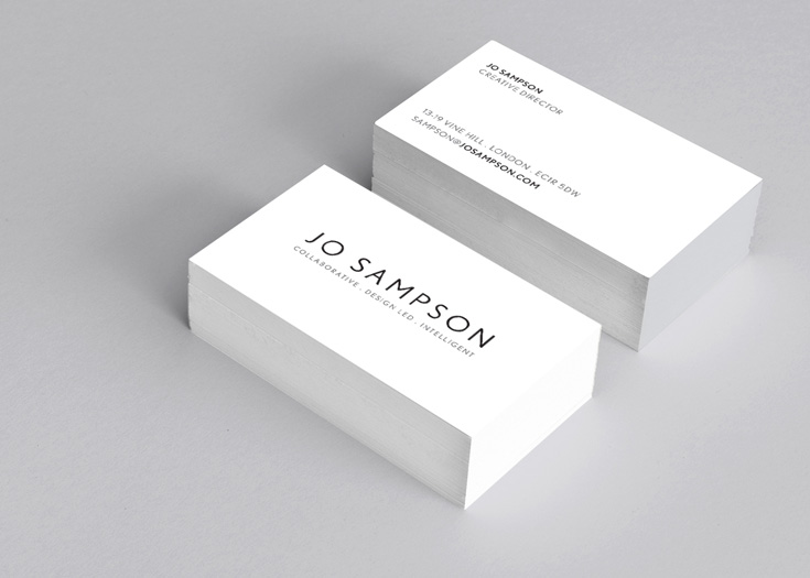
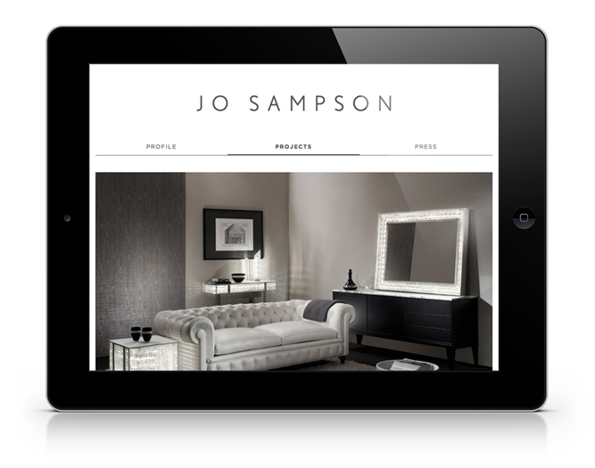
Jo Sampson Studio works with brands in the lifestyle arena. It offers a collaborative and intelligent approach to design led strategy and product development.

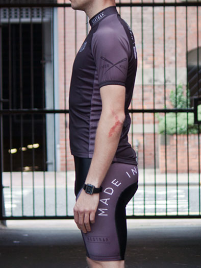
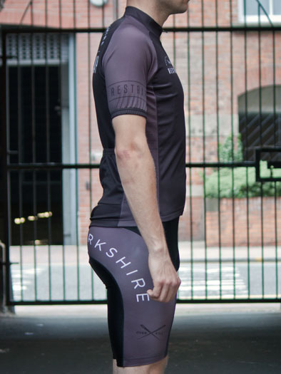
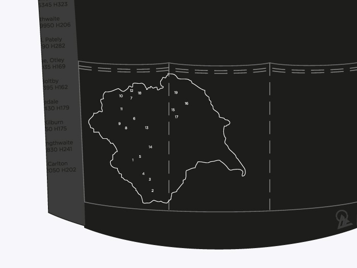
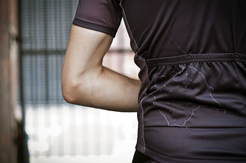
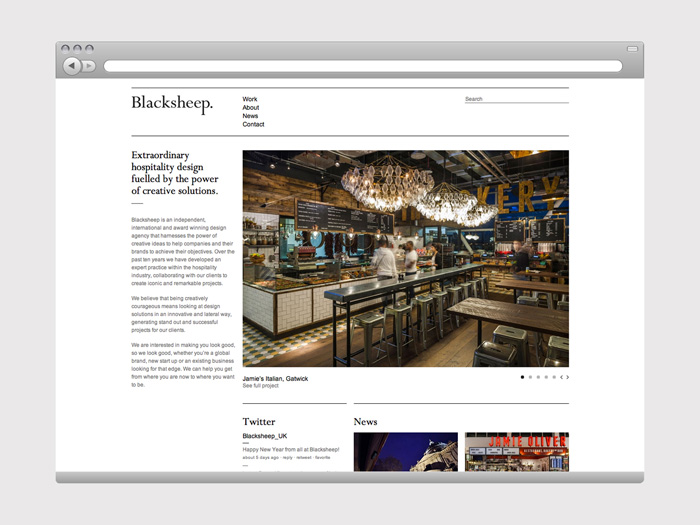
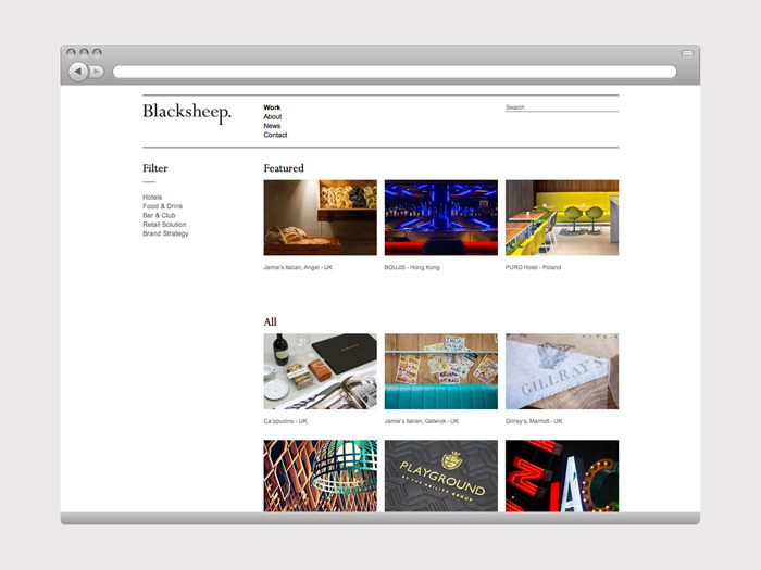
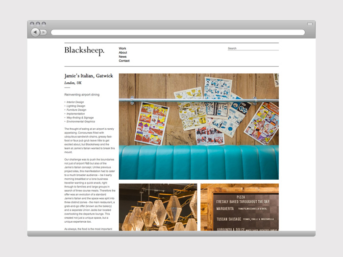
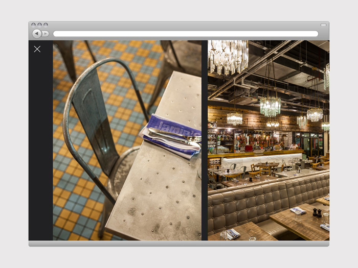
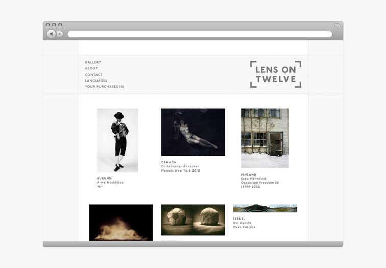
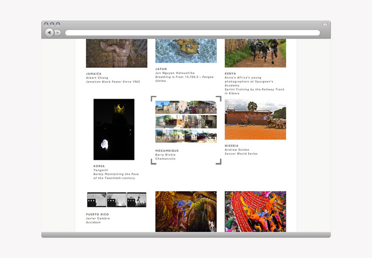
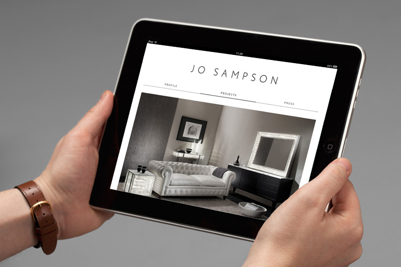
A high-end, fashion house aesthetic was created to appeal to the demanding clientele of the lifestyle market.

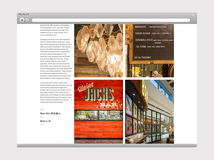
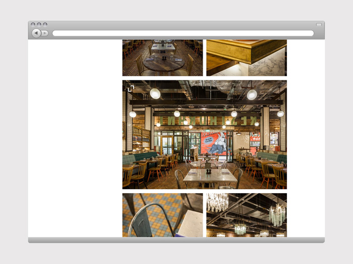
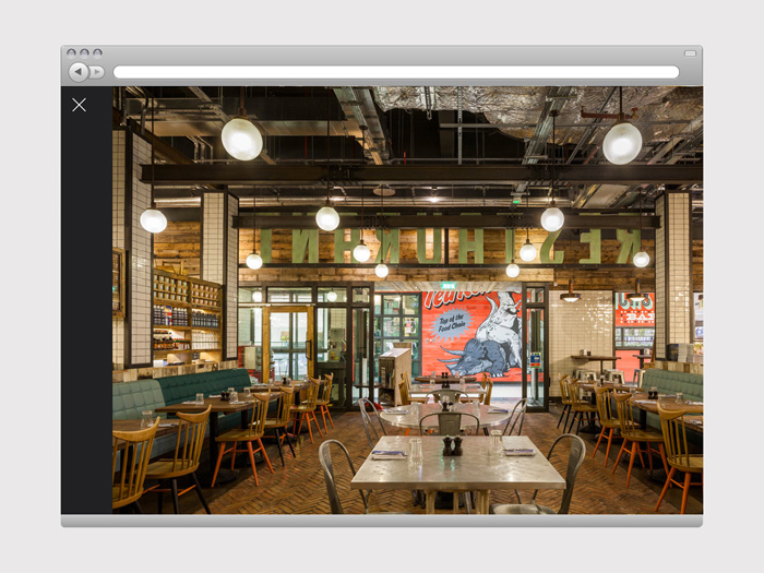
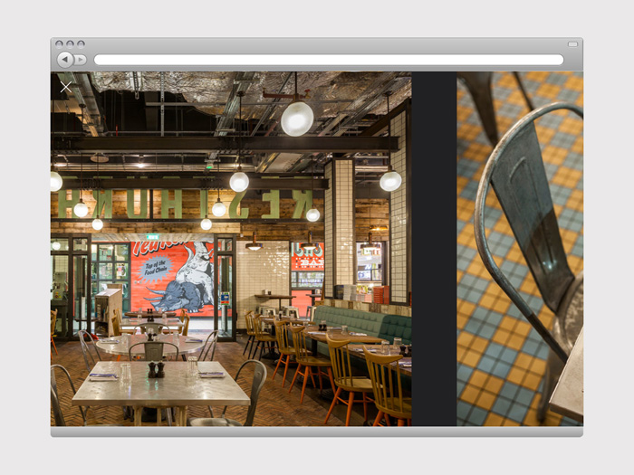
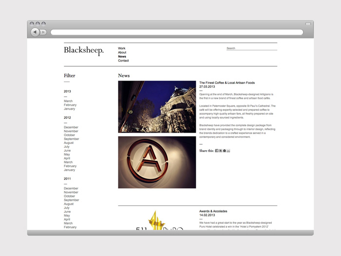
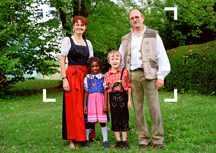
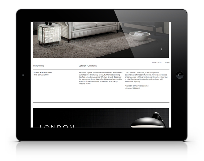
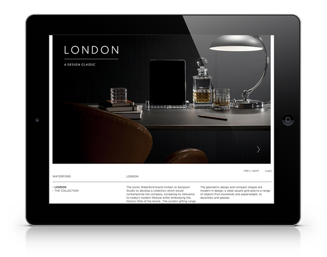
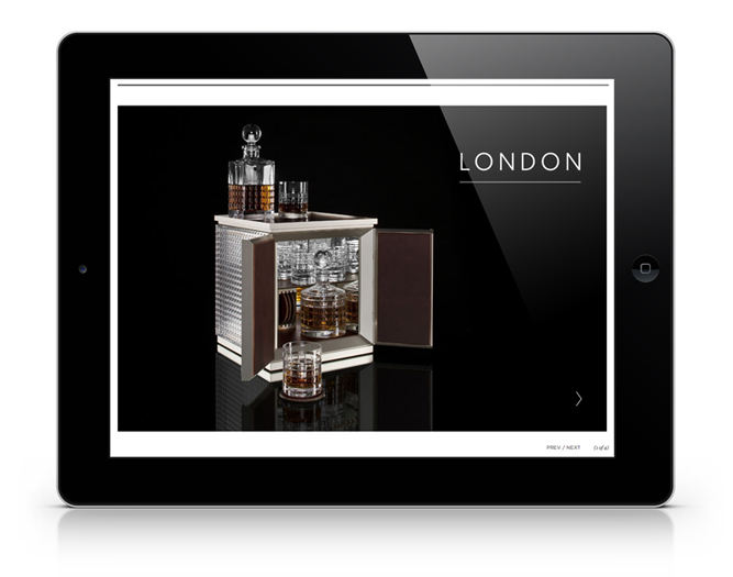
A modernist flexible and responsive website was created with an emphasis on large project photography showcasing the craft and quality of the work produced by the studio.

Designed at Blacksheep under the creative direction of Jo Sampson Studio. Build by Global Native.

RESTRAP: Team Kit

With an expanding sponsored team competing (and winning) in more cycling events and a growing public appeal, a cycling kit was designed that answered the needs of both parties.

Following the understated, simplified style of the RESTRAP a subtle, practical kit was designed keeping bright colours and lairy logos to a minimum.

A Yorkshire rose takes pride of place over the chest while any fellow riders caught behind the wearer will clearly see where the company hails from.

A numbered Yorkshire map sits on the lower back, relating to a list of the areas longest and steepest climbs positioned under the arms, on the contrasting grey panels.

Blacksheep: Website

Blacksheep is an independent, international and award winning design agency that harnesses the power of creative ideas to help companies and their brands to achieve their objectives.

With a new direction towards branding and holistic design solutions for the hospitality sector Blacksheep required a new website to effectively display their broad range of work and convey their creative process.

An editorial style website was created which frequently gets updated echoing the pace at which projects move around the London based studio.

The whole site is optimised for iPad viewing and by including a full screen image viewer, the site now acts as a portfolio for the directors when on new business.

Build by Global Native.

Tokyo Fixed: ‘The Dart’

Concept, naming and identity for one of Tokyo Fixed Gear‘s 2012 track frames. With compact geometry, steep head tube angles and oversized tubing it is the perfect fast frame for the city. It was therefore named ‘The Dart’.

The typography created in collaboration with Sam Hodgson, reflects the lightness, rigidity and speed the frame offers.

A gloss black on matte black paint finish was applied to the frame keeping the look understated and stealth-like.

Lens On Twelve

Connaught Brown, located just off Piccadilly, in the heart of London’s West End, is one of Britain’s leading fine art galleries. Their new exhibition ‘Lens On Twelve‘ shifts the focus of the London 2012 Olympic Games away from the athletes and back onto what artists of different nationalities around the world think of the global event through the medium of photography.

The identity of the exhibition references the framing and composition of setting up a photograph and echoes some of the markings when looking through a viewfinder of a camera. This device was then applied to art works in the show to create a strongbrand association.

A fluid and flexible content management system and website was designed enabling the client to edit the amount of artworks when required. Due to the international nature of the galleries clientele, the e-commerce system was able to calculate costs for shipping different sized and weighted works, framed or unframed, worldwide.